


May 20, 2021
Sisu Data Announces Smart Waterfall Charts
![]() May 20, 2021 — Sisu Data debuts Smart Waterfall Charts, a combination of data exploration and storytelling.
May 20, 2021 — Sisu Data debuts Smart Waterfall Charts, a combination of data exploration and storytelling.
The ever-increasing size and complexity of cloud data magnifies the challenge analysts face to make sense of it, and to deliver the right information to the right person at the right time. Finding the high-impact populations that explain changes in metric performance is hard enough when there are millions of possible reasons. And then the work of condensing those findings into a simple, digestible story remains.
Our new Smart Waterfall Charts address this challenge head-on. They’re designed to help every analyst find the factors that matter in their complex data and then effectively synthesize, visualize, and share them. It’s the next step in our mission to operationalize the world’s data and augment the entire analytics workflow from the cloud warehouse all the way through the point of decision.
These Smart Waterfall Charts are powered by a new set of algorithms that help analysts identify the key drivers of performance and deliver fast, actionable, and immediately understandable answers to key business questions.
A faster, augmented approach to finding answers in complex data
Our Smart Waterfall Charts leverage Sisu’s powerful decision engine to rapidly search high-dimensional data for relevant trends, dimensions, and changes, and build clear visualizations that support decision-making in three ways:
- Automatically finding the top drivers that explain change
- Presenting the sequence of factors based on impact
- Allowing for fast iteration and customization
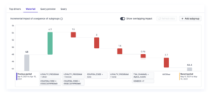
Let’s look at an ecommerce sales example to see the power of these visualizations. In this scenario, an ecommerce company wants to understand what factors are driving changes to key metrics like Average Order Value (AOV). While analysts can create simple waterfall charts using their legacy BI tools to visualize one dimension at a time, they’re unable to factor in multiple dimensions that work together to drive metric performance.
Sisu’s Smart Waterfall Charts automatically surface a sequence of populations, bridging multiple features, that are having the biggest impact on their metrics. From there, it’s simple to make fast, iterative changes to your Smart Waterfall Charts, like shifting the order of populations, or adding and removing them, to shape your recommendation — no SQL needed.
Deliver actionable answers every time
Smart Waterfall Charts automatically account for overlaps as you iteratively make changes to your visualization. By identifying these overlapping populations, you’re able to visualize the incremental impact of each population and focus your recommendations on the most actionable areas for business investment.

Click to view gif.
In addition to launching Smart Waterfall Charts, we’re also introducing a new algorithm to continuously improve the results that our engine returns, ensuring that out of millions of possibilities in the data, analysts can focus on the drivers in their data that matter most.
Using our new algorithm, Sisu now has the power to surface only the highest-impact, statistically valid drivers. This enables analysts to quickly focus on only relevant populations in the data, backed by a statistical guarantee.
Here’s an example: a media company with data on viewer demographics like age, gender, and location may find that California teenagers (State=CA and Age=<18) are lifting a key metric, like user Churn. Prior to this update, Sisu’s results would also show other populations like State=CA, County=LA, Gender=Female, or Age=<18 impacting Churn since they include California teenagers.
With Sisu’s latest algorithm, we no longer surface these overlapping populations that do not incrementally explain the change in the metric. This helps analysts quickly focus their time and attention on diving deeper on the most statistically significant facts. (If you’re interested in the theory and application of how Sisu makes these selections, check out Vlad Feinberg’s latest Learning, Unsupervised writeup of glmnet and Lasso, and Barak Oshri’s exploration of the error control theorem in Stability Selection.)
Tell a clear story and drive confident decisions
Just as important as being able to quickly analyze all your cloud-scale data to find answers is the ability to tell a clear story that empowers stakeholders. If you’re not able to provide understandable answers that the business can trust, you end up fielding additional questions, instead of moving on to the next thing on your to-do list.
Sisu’s Smart Waterfall Charts make it easy to clearly present your recommendations to stakeholders and to make complex data-storytelling simple. Just run the analysis in Sisu, let Sisu automatically build your clear waterfall chart, make any edits you like, and then share the analysis with your key stakeholders—all in seconds.
Born in the cloud and designed for highly-parallel processing, Sisu is purpose-built to handle the volume of data your business captures today. Combining automatic feature engineering, model selection, and a novel query engine, Sisu is the only platform powerful enough to analyze hundreds of millions of factor combinations in seconds to help teams pinpoint key metric drivers and quickly focus on what matters, now.
Source: Gaurav Saraf, Sisu
Leading Solution Providers


